

Image
This page contains examples of different usages and styling of the Image component.
Basic
This example shows an Image component with default minimal configuration:
- Image retrieved from linked page
- Image alternative text retrieved from linked page
In order to display the image from the linked page in the component, the linked page (Dialog > Metadata > Link property) is required to have a Featured Image configured in its Page properties, as it is the case for the image at the left side of the example below.
If no page is specified in the Link property of the dialog (Dialog > Metadata > Link property) or a linked page with no Featured Image is chosen, then, the Image component will be displayed empty in Author mode and not displayed in Publish mode. This behaviour is showcased in the image component at the right side of the example below.

Image asset from DAM
In this example, the image asset is added from the DAM. The image is not linked to another page, therefore clicking on the image does not redirect to any page.
 Exceed the Highest Standards
Local image asset
Image asset can also be uploaded from the user local machine. In this example we have configured different properties in the dialog:
- Image uploaded from user's local machine
- Alternative text for image
- Image caption displayed as popup when mouse hoovers over the image
- Linked page which opens Crosscutting Concept page in a new tab

Rounded images
Image styling offers the possibility to show any image in a rounded format. In this section, 3 examples with the different rounded styles are shown.
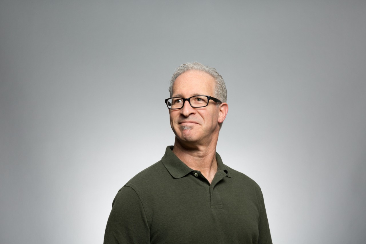
 Author John Doe
 Author John Doe
 Author John Doe
Rounded images in Responsive Layout
In this example, 3 images with the different rounded styles are shown inside a responsive layout container.
 Author John Doe
 Author John Doe
 Author John Doe
Container and background styles
Container with full page width and primary light background

Container with background full page width and primary dark background

Container with secondary light background

Container with secondary dark background
