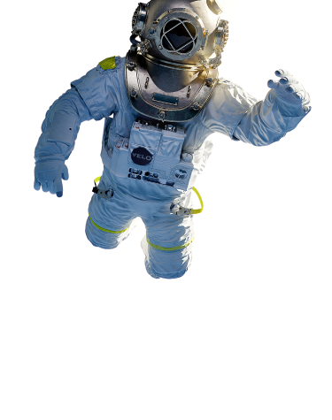
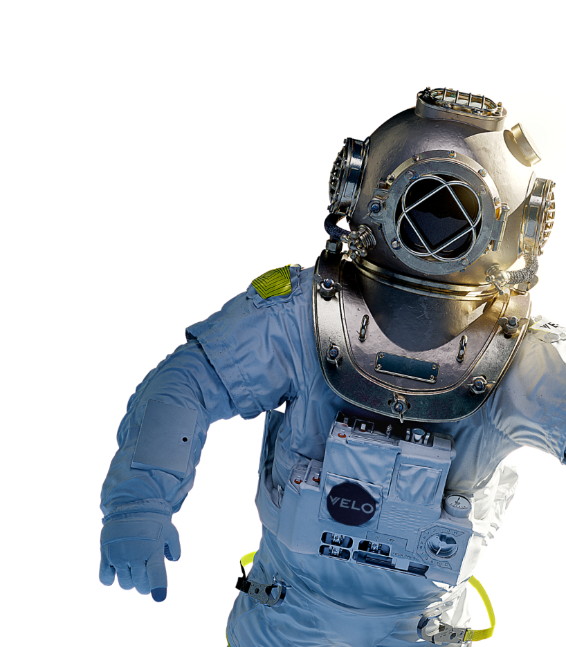
BOLSAS DE NICOTINA
PARA UTILIZAR EL SITIO WEB DE VELO DEBES SER MAYOR DE 18 AÑOS.
Por favor, verifica tu edad antes de entrar al sitio*.
Progress Bar
This page displays the Progress Bar component basic functionality and styling variations.
Description
The Progress Bar component can be used to display progress which is predefined by the content editor.
Default
In this example the default values for Progress Bar component are used:
- No progress set
- Styles are default
Configured to 30%
In this example the Progress Bar component is configured to:
- 30% progress
- Style is large bottom
Configured to 100%
In this example the Progress Bar component is configured to:
- 100% progress
- Style is small bottom
Container with full page width and primary light background
Default
In this example the default values for Progress Bar component are used:
- No progress set
- Styles are default
Configured to 30%
In this example the Progress Bar component is configured to:
- 30% progress
- Style is large bottom
Configured to 100%
In this example the Progress Bar component is configured to:
- 100% progress
- Style is small bottom
Container with background full page width and primary dark background
Default
In this example the default values for Progress Bar component are used:
- No progress set
- Styles are default
Configured to 30%
In this example the Progress Bar component is configured to:
- 30% progress
- Style is large bottom
Configured to 100%
In this example the Progress Bar component is configured to:
- 100% progress
- Style is small bottom
Container with default width and secondary light background
Default
In this example the default values for Progress Bar component are used:
- No progress set
- Styles are default
Configured to 30%
In this example the Progress Bar component is configured to:
- 30% progress
- Style is large bottom
Configured to 100%
In this example the Progress Bar component is configured to:
- 100% progress
- Style is small bottom
Container with default width and secondary dark background
Default
In this example the default values for Progress Bar component are used:
- No progress set
- Styles are default
Configured to 30%
In this example the Progress Bar component is configured to:
- 30% progress
- Style is large bottom
Configured to 100%
In this example the Progress Bar component is configured to:
- 100% progress
- Style is small bottom