Carousel
The Carousel, by default, allows 3 components to be embedded:
- Experience fragment
- Image
- Teaser
The components above can be embedded into a single Carousel: it is the editor's responsibility to adapt the size and style of the embedded components to have a common look and feel.
This page contains examples of the usage of the Carousel component with different styling variations.
Using Teaser Component
Using Experience Fragments
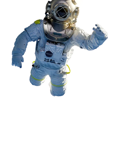
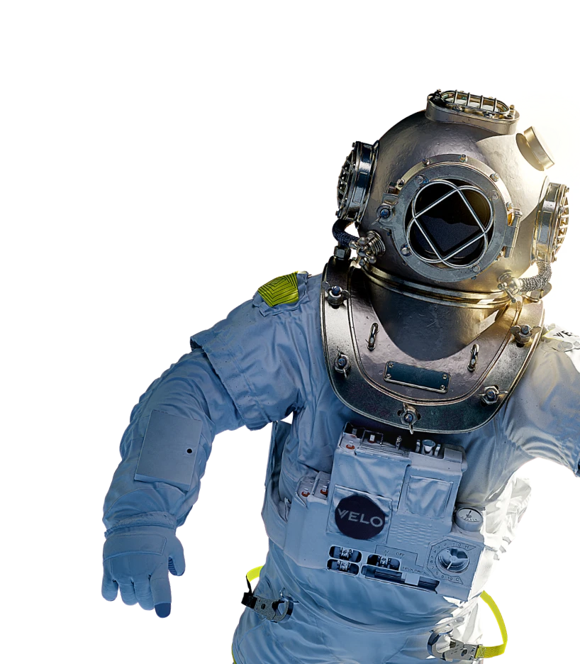
Using Image component


Container and background styles
When the Carousel component is placed inside a container, its styles are adapted to the background colour of the container.
The embedded components are also adapted accordingly.
In the examples below, different styling options are also applied to the individual embedded components.
Container with full page width and primary light background


 BATcom


Container with background full page width and primary dark background
 BATcom


Container with default width and secondary light background
 BATcom


Container with default width and secondary dark background
 BATcom

